Coke & Go
Project overview
Vending machines are a huge part of the Coca-Cola corporate profile.
They provide a low maintenance, low cost and highly effective income stream. The machines themselves have evolved to become sophisticated and engaging touchpoints for customers whilst in turn producing a wealth data generating insights.
Coca-Cola UK was tasked with researching the feasibility of adapting UK vending machines to deliver a similar or improved customer experience to those found in the US and parts of Asia.
Customers were able to purchase drinks through an app and collect them from the cooler whilst gathering loyalty points and free product combos.
Role: Lead UX Designer
Timescale: 3 weeks

Approach
- Review and enhance existing planning assets
- Define a phased approach to outputs
- Review existing Coke & Go products and integrations
- Develop user journeys in collaboration with stakeholders
- Create multiple clickable Figma prototypes to illustrate user journeys
Research
As a contractor brought into the final stage of delivery I sometimes need to digest and make sense of vast swathes of information. Some useful, and some irrelevent, discerning what appetite the client has for delving deep into the research findings is a talent in itself! In this instance I focused on the practicalities of a working to a hard stop deadline looming before the festive holidays. Key outputs from various workshops; Personalisation, Loyalty program, Partnerships and Redemption flexibility
Direct and in-direct competitor analysis
With so many loyalty schemes in the market consumers benefit from consistency and familiarity. By mimicing some of the approaches consumers are used to we would be able to offer an intuitive interface and increase early adoption.

Simplify
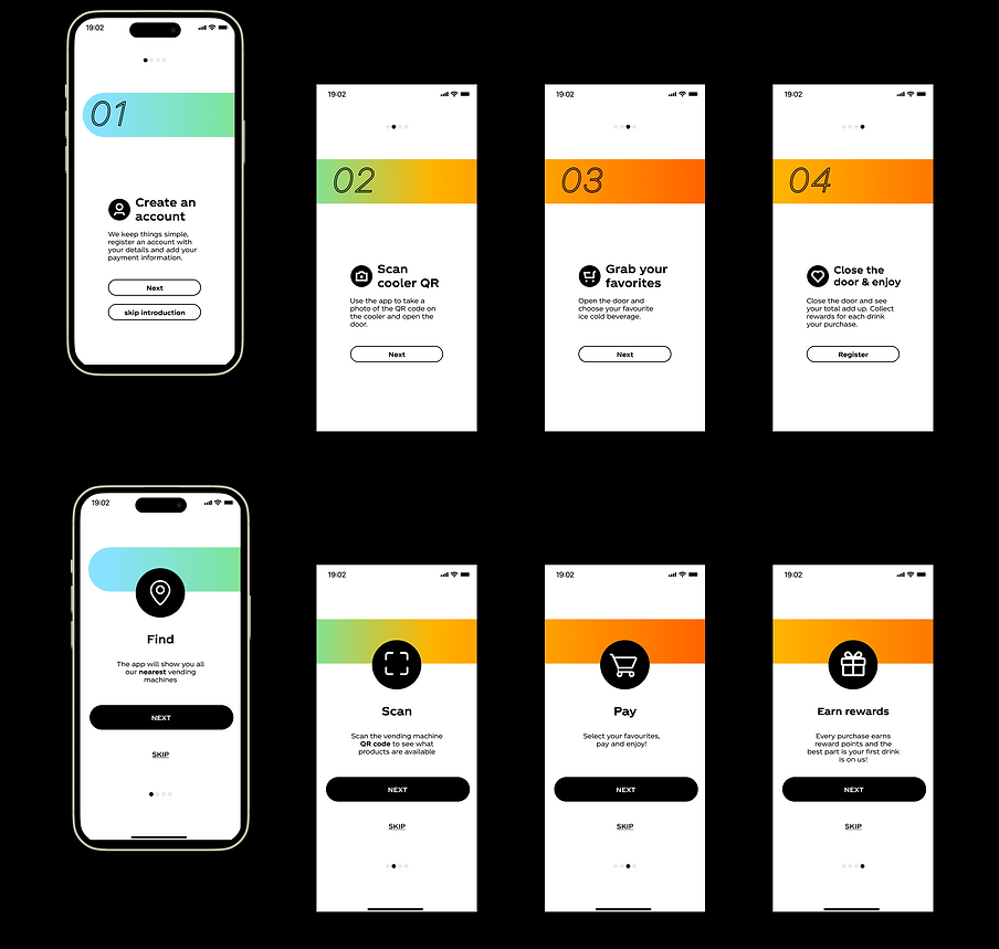
Stakeholders get information overload as to users. The first task I set myself was to create less detailed userflows with very lo-fi imagery to help bring the user jouneys to life, never doubt the value of simplicity!

Reflecting reality
As UX designers we need to shelve personal opinion in favour of creating a solution that is truthful to the product, the design system and timeframe. With a mere three weeks on the cards I stuck to simplifying copy, removing superfluous numbering and entrenching the iconography. Users don't need an explanation about how to create an account, they need to be shown the unique features of an application and understand the benefit to them in using the app.
Hence I focused on singular words as much as possible to reduce cognitive load and presented 3 unique actions; Find, Scan, Pay in the order they would be followed in the app followed by Earn rewards so user saw the value in performing these three easy steps.
Account creation
I maintain that if a development team is going to spend time recoding parts of an application you may as well try to improve areas that slipped through the cracks.
Utilising Magic Link account creation users no longer need to remember passwords and there is no need to divulge Google / Facebook credentials.
Informative delight
With such a well established brand Coke could utilise visual components in unique ways, a progress indicator for example could hold interest as well as inform users on the progress of their purchase.

Feedback loop
As part of the ongoing research into the feasibility of bringing external concepts into a European marketplace there was a strong need to engage directly with consumers on their experience of what would be a flagship digital product in Europe.
I enhanced the feedback loop and offered users the ability to quickly engage or dismiss the request for feedback.

Conclusion
Hugely compressed timelines can really be beneficial in terms of getting to the point of what is most neccessary very quickly, the noise is eliminated and a team, researcher or in my case, a designer can get down to shaping a solution or product which will at the very least provide a solid foundation to test ideas off.
I really enjoyed working with the team at Wunderman on this mini project. I was able to provide strong logic to proposed amends or enhancements that the client would be able to take forward and guage where they further invested their development and research.
The only downside with presenting my final four journeys is that I'd not get to see how the testing of these solutions evolved, but from the perspective of being truly 'Agile' this project was agility personified!