DASHBOARDS
Overview

For over 20 years I've noted how the evolution of data consumption, visual representation and data delivery has evolved.
We as consumers and users have evolved too! We expect certain interactions to be commonplace, we can filter information quicker than ever before and the predictability and patterning of UI interfaces and functionality has evolved to a point where for the most part companies are working from the same song sheet as it were!
Some of the key aspects I've learnt, developing complex interfaces that appear simple yet hide a myriad of functional components and offer unique challenges to both developers and designers are the following.
Shoot for the stars!
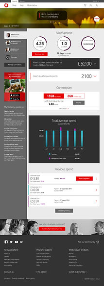
Building a data rich interface as we did for Vodafone's Billing and Usage team required the logic of 'pretend this is doable'.
Sometimes the data integration is not straight forward, differing systems can cause delays in accessing and displaying data, so start from the basis that anything is possible and adopt a backend agnostic approach.
This free's up designers to work through ideas whilst developers can simultaneous keep solving their own set of complex issues but they are able to use skeleton structures to guide the logic of their coding.
Understand your end user
Data consumption and task completion can be vastly different between personas.
Understanding the priorities of an account administrator versus an end user can help steer UI in directions that in themselves present unique challenges. Learning from each can help evolve the strategic thinking too. How much information can be consumed? What are their priorities? User research, multiple rounds of testing and a healthy relationship with stakeholders will help keep both approaches on track.
Take a look at the approaches for the common telco usage dashboard. One is highly detailed appealing to an account administrator who needs a multi faceted, snapshot view of a complex set of billing, usage and account administration. And the other is an end user who has no need to perform many tasks besides keeping on track with their spending habits and singular account.
Business with multiple accounts

Consumer with a singular account
BITE - SNACK - MEAL
Progressively revealing information as and when a user needs it is one approach that has helped declutter interfaces and drive users towards viewing the most important information first or assists users in task completion without distraction.
With the need for responsive layouts and screen real estate being at a premium I cannot advocate strongly enough how effective this strategy is at eliminating noise whilst delivering real punch in terms of user satisfaction.

Think 'Software as a service'
Almost all the software we use these days is sitting happily in a cloud somewhere offering seamless integration into your workflow and lucrative subscription based dependency if done correctly. Gone are the days of 'owning' anything. We want software that always works, storage that never reaches capacity and interfaces that are a delight to use both in visual design and brutal simplicity.
When conjouring up a product selection tool for RS Electronics and their unbelievably complex and detailed product offering of quite literally billions of electronic components, we focused on solving a problem for engineers.
We wanted to digest multiple complex data stores, clean the data from these multiple sources and offer the equivalent user journey as someone would get when selecting and configuring a car purchase.
Simplicity, predictability and product comparison (no upselling, not marketing, just pure unadulterated problem solving).
As complex as the data stores may be, offering a simple task based, problem solving UI is key

Step 1
An interface that focuses a user toward task completion

Step 2
Guide users through relevant options
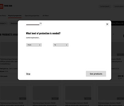


Step 3
Offer a recommendation, comparison and purchasing options immediately

In summary
Dashboards can offer an overwhelming amount of information to users if done badly.
I will always advocate simplicity over 'functionality'. All dashboards are functional, but are all dashboards solving the problems that they set out to in the first place? Keep it simple, let the data do the heavy lifting and keep your users on track to task completion.
We can learn an immense amount from the restrictive interfaces of mobile, we eliminate clutter and think of innovative ways to present complex information.
I will no doubt expand on this small case study, but for now, take my word for it, useful and delightful interfaces are a goal worth investing in!